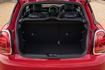
MINI Electric Hatch interior, tech and comfort

- Quality materials and upmarket image
- Supportive seats, but little elbow room
- Quirky cabin styling
How is the quality and layout?
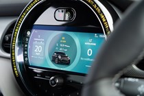
Quality is very good, but the layout is a little unusual. Like the standard MINI Hatch, the electric model has a small digital gauge cluster mounted on top of the steering column and a large infotainment system set into a circular mount, complete with a psychedelic mood light which changes colour depending on your chosen drive mode.
The design is supposed to hark back to the central speedometer of the original 1960s Mini, but we’re not convinced it was the best solution for the modern era. It doesn’t use the available space in the dashboard well, which means the infotainment system is like a letterbox. That disco light can get a little annoying, too.
The toggle switches in the centre console are a bit of a gimmick, but they add to the car’s charm and feel high quality. It will take you a few drives to learn where all the controls are and what they do, though, because they’re unlike any other mainstream car on the market today.

For example, the start button is on a weird fighter jet toggle in the middle of the centre console rather than on the dashboard near the steering wheel. The infotainment system can also be controlled via touch inputs or from a rotary dial between the front seats. The brake regen switch gave us grief, too, as it’s located on a very innocuous toggle on the left-hand side of the dash.
Infotainment and technology
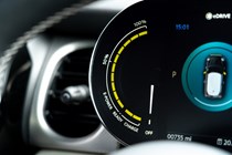
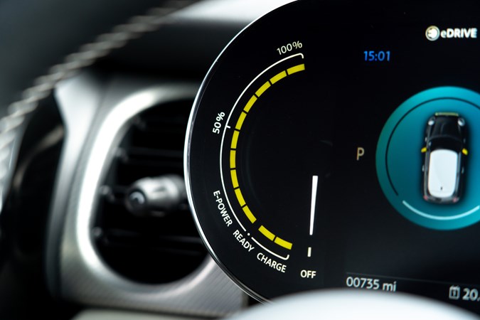
The MINI Electric’s digital instrument display is simple and easy to read, with big graphics that fit the car’s slightly cartoonish styling. However, the display is covered in frosted glass, which mutes the clarity of the screen and makes it nigh-on impossible to read in anything other than cloudy weather. If you have one with a sunroof, any stray ray of sunshine can completely obscure it.
There isn’t much to configure, either, which is either a blessing or a curse depending on how much of a technophile you are. There’s a single switch on the indicator stalk which cycles through the car’s efficiency figures and trip functions – but all that changes is a number on the bottom right-hand corner of the screen. The Honda e has a lot more to fiddle with.
We’ve already touched on one of the drawbacks of the car’s 8.8-inch infotainment system, but there are others. For starters, it’s only compatible with Apple CarPlay which alienates Android users. The menu buttons on the sat-nav screen are also miniscule which, when paired with the MINI’s stiff ride, makes them rather difficult to use on the move.

Comfort
- Supportive front seats
- Cramped rear seats
- Claustrophobic dimensions
The MINI Electric’s seats are quite good. They have a reasonable amount of adjustment and they’re fitted as standard with heating elements. The bolstering around your kidneys is decent, too, but we’d have liked to see a little more support for the driver’s shoulders. Push it hard into a corner and your torso will act like an upside-down pendulum, throwing your head to the outside of the curve.
You can improve the spec of the seats by shelling out a little more money for the Level 3 model. That car’s seats feature lumbar support and an extendable thigh rest, which makes the MINI Electric easier to live with over long distances. That’s slightly ironic considering it can only do around 100 miles in mixed driving before needing to be recharged, but they’re nice extras to have.
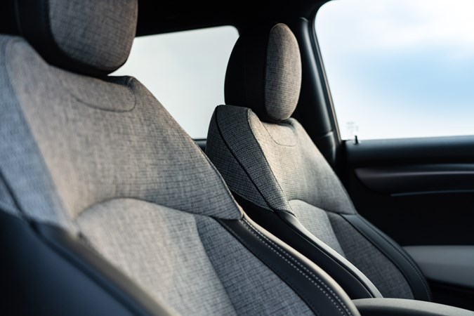
As we’ve already mentioned, the MINI Electric also feels quite small on the inside, especially if you opt for a car with dark upholstery and no sunroof. There’s isn’t much space between the two front passengers, elbow room is at a premium everywhere and the thick pillars make the cabin feel rather claustrophobic. The Honda e’s cabin is a far more airy and pleasant place to be.


