Vauxhall Mokka-e SUV (2020-2025) interior, tech and comfort

- In-car tech is up-to scratch and usable
- Not the most spacious small SUV
- Digital dashboard as standard
How is the quality and layout?
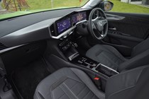
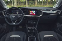
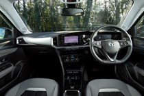
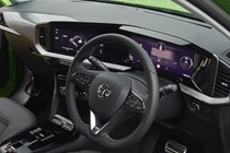
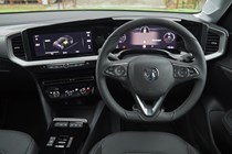
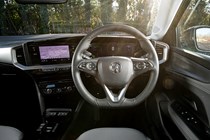
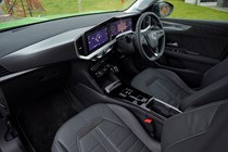
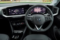
As with the combustion-engined Mokka, the Mokka Electric features a tech-packed dashboard that borrows plenty from the Peugeot e-2008. It’s a good set-up and at least you’re not saddled with the French car’s divisive driving position. The 12.0-inch digital dashboard is unique to the Mokka range, though, and gives the car a thoroughly contemporary appearance, even if it lacks a little visual flair.
In terms of interior quality, the Mokka Electric isn’t as good as it might be, which is a shame because it looks good, and aligns with the sharp and eye-catching exterior styling. The trim and materials aren’t nearly as inviting as those used in the Peugeot e-2008 or Niro EV, but in its defence, the Mokka Electric is cheaper than both of those rivals.
We’re fans of physical buttons for major controls and it’s good to see that Vauxhall has retained some and avoided going down the road of making everything controlled from the touchscreen. So, there are buttons and knobs for the climate control and media volume, which are important touchpoints for most drivers in daily use.
Infotainment and tech
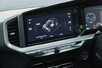
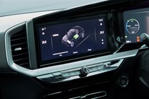
The digital instrument panel is complemented by a 7.0-inch touchscreen for the infotainment on lower-spec cars, and a 10.0-inch set-up on higher specification models (pictured below). Vauxhall calls the layout the ‘Pure Panel’, and although there are still buttons in the cabin, a lot of control has shifted into the touchscreen.
The set-up looks smart, but the software isn’t so easy to use while on the move. All models come with Apple CarPlay and Android Auto as standard, so you can switch to those instead, even if built-in sat-nav and connected services are also offered.
The system can be laggy and some regularly-used functions are nestled within sub-menus (such as if you want to change the distrbution of heated air from the screen to your feet). We’ve also found that it can be a little fussy about what cable you use to connect your phone. So, it pays to make sure you have a good quality item before assuming that the system isn’t talking to your phone.

Comfort
- Supportive, comfortable front seats
- Not so great in the back
- Better than the Peugeot it’s based upon
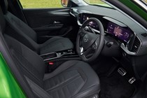
It’s easy to get comfortable at the wheel, and the driving position is good, too. There’s an excellent range of adjustment to the reach and height of the steering wheel and driver’s seat, as you’d expect, but we found that long distance support and comfort are very good. It’s also worth repeating that although being closely related to the Peugeot e-2008 you aren’t stuck with that car’s tiny steering wheel and high-mounted instrument panel, which forces you to adopt an unconventional driving position.
One small gripe is that the dials themselves don’t have much of a hood over them, so in some circumstances they can be obscured by bright lights.
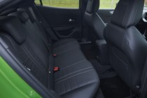
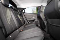
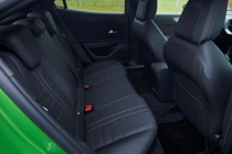
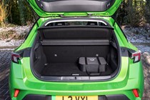
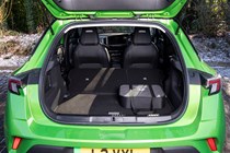
As we’ve covered in the previous Practicality section, the Mokka Electric’s cabin is cramped, especially for those sitting in the rear, which is a disappointment for a car pitched at small families.


