Volvo XC40 Electric interior, tech and comfort
- Google-powered infotainment is great
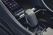
- High-quality and stylish interior
- Some more physical switchgear would be nice
How is the quality and layout?
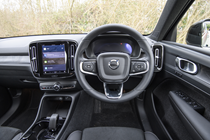
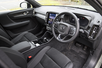
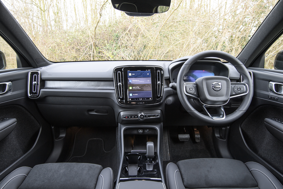
Volvo really nailed the XC40’s interior, so much so that even five years on it still feels fresh and premium. It may not have the initial wow-factor of rivals such as the Mercedes EQA or BMW iX3, which make a statement with their vast, widescreen displays dominating the dashboard, but look more closely and you’ll find there’s plenty to enjoy.
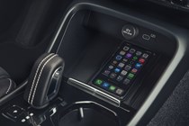
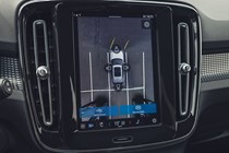
The centre console’s dominated by a portrait-oriented, 9.0-inch touchscreen display. Volvo’s routed everything through here, which unfortunately means you will need to dive into menus to adjust things like the drive mode or the climate controls. The latter are particularly fiddly with small on-screen buttons that require a precise tap – not what we’d hope for from safety-conscious Volvo.
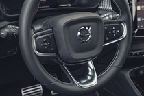
The steering wheel may appear to be more of the same, with unlabelled buttons – but these are really easy to get the hang of and will be second nature after a couple of days of ownership.
The quality is excellent, for the most part. Cheaper materials are largely confined to the areas where you don’t often touch, and everything you do interact with feels good. A great example is the air vents, which have gorgeous knurled rotary stops and feel fabulous. One area specific to the electric Recharge model is less pleasant to the touch, though – the 3D-printed panels across the centre of the dash. These are backlit and look fabulous at night, but during the day look ugly and feel nasty.
What doesn’t feel at all nasty is the optional wool upholstery on top-spec Ultimate cars. It’s pricey, but really lifts the cabin and makes a welcome change from so-called ‘vegan’ leather.
Infotainment and tech
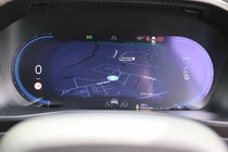
Volvo’s 9.0-inch infotainment screen runs the latest version of Android Automotive – Google’s operating system for cars. This means it has native support for Google Maps as well as Google’s voice assistant, which is far superior to any manufacturer solution we’ve tried so far.
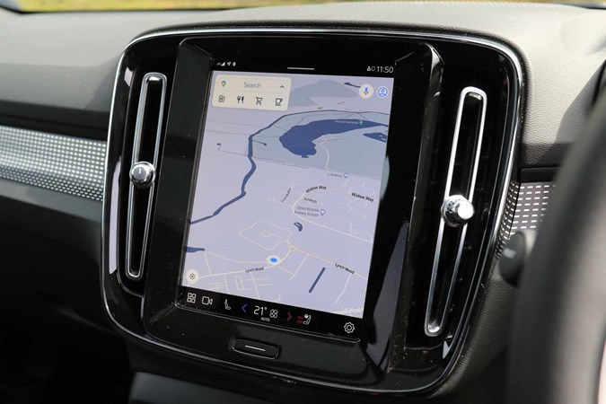
The display itself is bright, clear and responsive, and the interface is based around lists and submenus. Once you’ve got the hang of where everything is, it should be easy enough to navigate, but there’s a bit of a learning curve here.
For people who are fully ingratiated into Google’s ecosystem already, Android Automotive is brilliant. It’s less useful for people who prefer alternatives, though there is now support for Waze on the mapping front as well as Apple CarPlay for iPhone users.
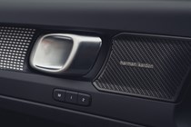
Audiophiles should consider the top-spec car with its Harman Kardon sound system. On an electric car, where you have fewer distractions from your music, it makes a real difference – though it’s not quite on the same level as the Bowers & Wilkins setup you’ll find on larger Volvos.
Comfort
The XC40 Recharge is generally a very comfortable place to be, whether you’re driving or a passenger. The front seats have loads of adjustment for drivers of all sides, though the particularly tall should go for a Plus model or above with their extendable seat cushion to improve under-thigh support.
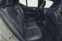
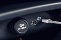
The rear seat is nicely sculpted for two passengers, and offers plenty of lumbar support. There are a pair of USB-C ports to keep occupants happy. Refinement is a highlight, with the only real noise coming from the large side mirrors. Otherwise, there’s no engine noise (obviously) and road noise is well-insulated.


